Allo Darlin’, I Love You.

logo

I have gone and fallen hard and fast in love, I’m that kinda girl. The object of my mass affections is the band Allo Darlin’. They rock. I only stumbled across them a few weeks ago and their music has literally not been out of my ears since…..I found their first self titled album from 2010 and adored it from the very first moment, then oh my goodness, they just released their new album; Europe. I didn’t think I could love any album more than the first but, now I have two albums that make me wanna jump up and down ever so high, yay.

Elizabeth Morris has a gorgeous velvet voice and the lyrics are the cutest and most sincere darn words, gee whizz, I wish I could be in their band.

See and hear more at allodarlin.com

My My Marian Mahler!

My teeny weeny love affair with the Fashion and Textile Museum has meant that I have see their ‘Designing Women’ exhibition a fair few times while it has been on… a most darling display of the most iconic post war British textile designers work, Lucienne Day, Jacqueline Groag and Marian Mahler. I scooted past the sheets of rare fabric on my way to and from the talks I’ve been attending there and was bedazzled by their gorgeousness. The work of these women changed the face of design after the war, they were real pioneers in modernism. Today so many brands and designers either nod to or plainly try and mimic these works…but there sure aint anything nearly as wonderful as the originals.

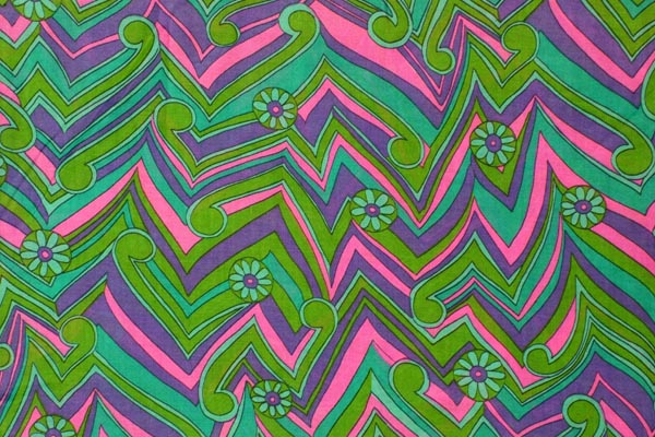
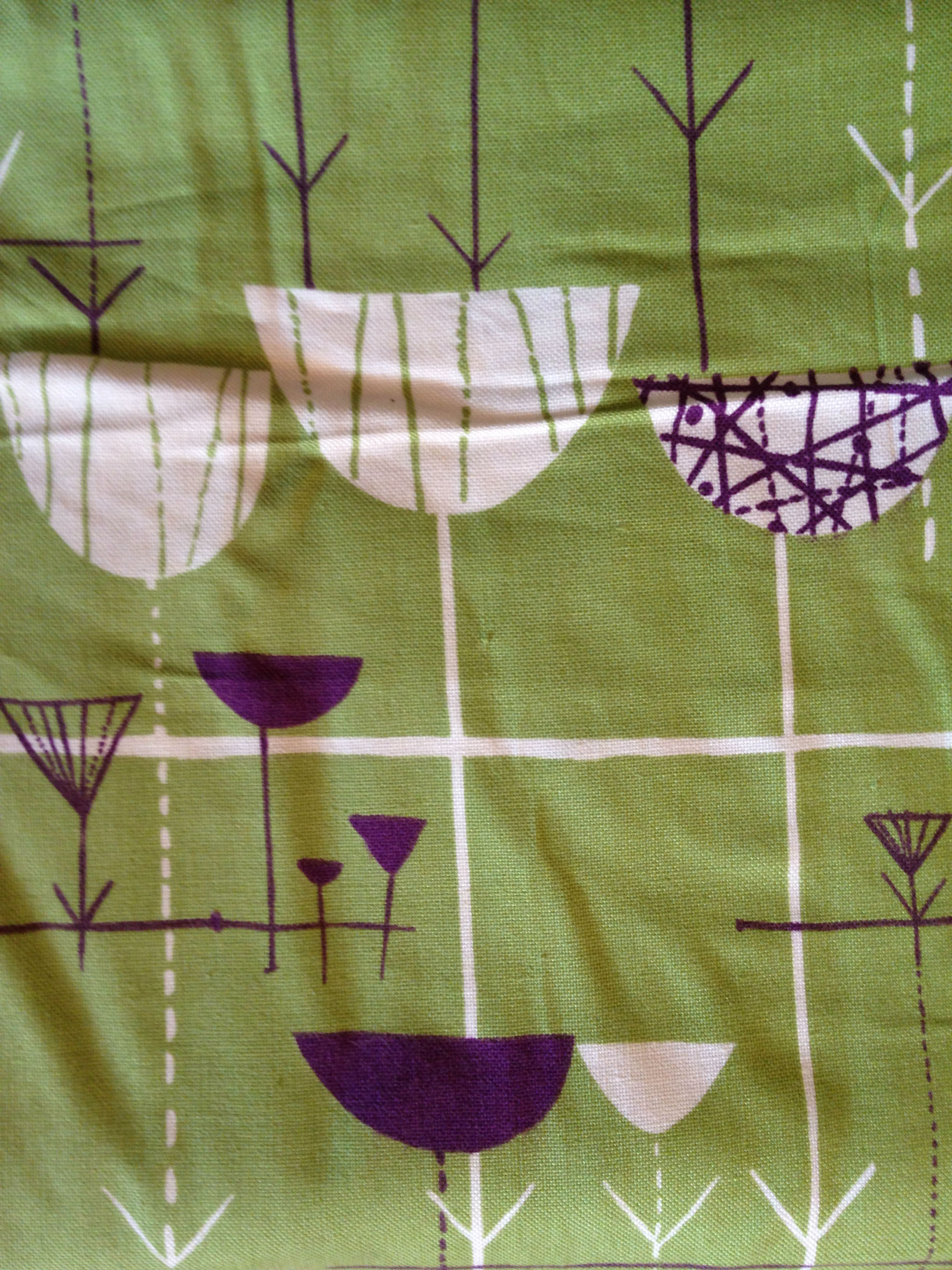
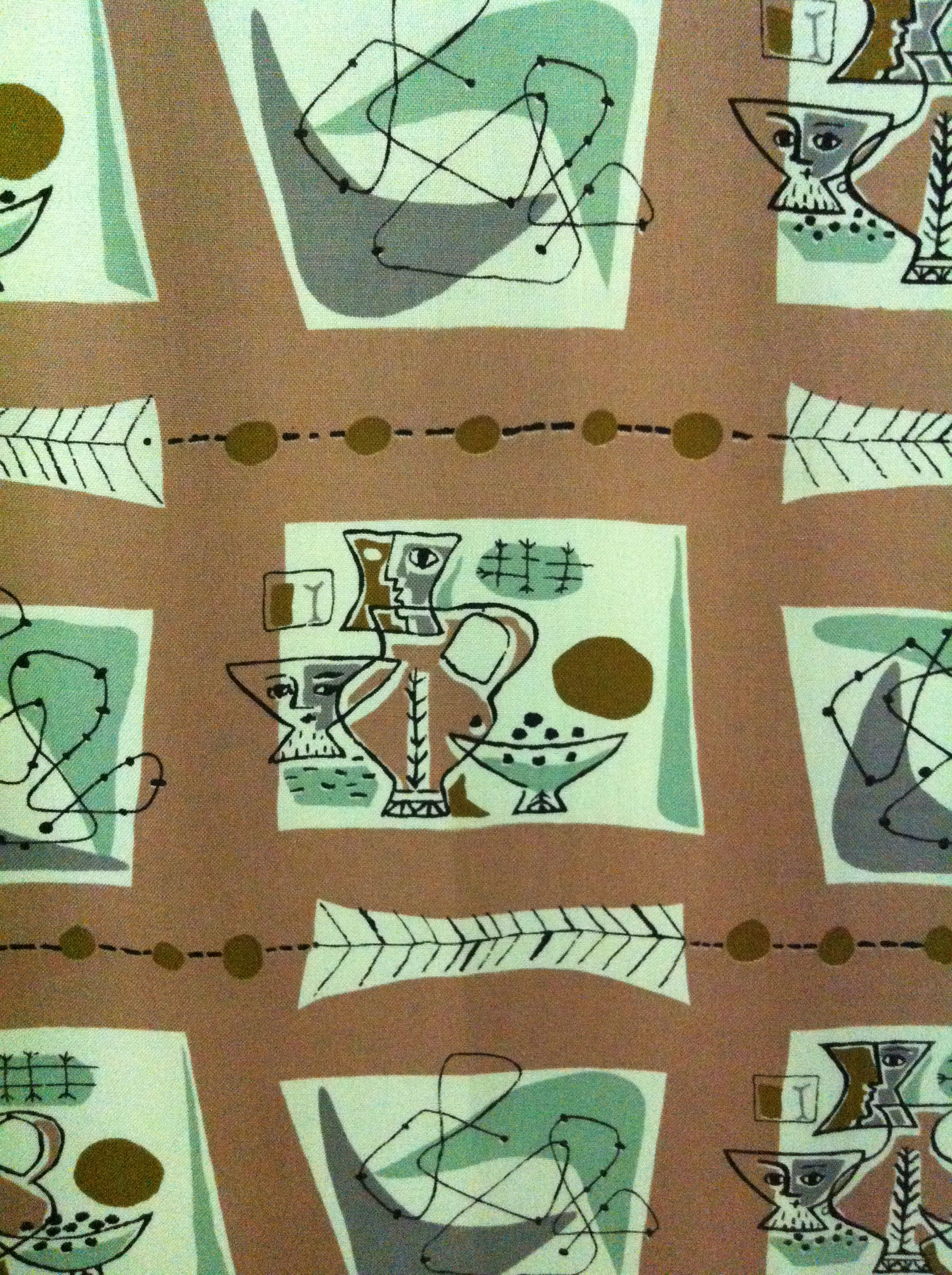
Because of my work, I quite often get my sticky mitts on vintage fabrics as well as fashion, although fabrics are not my main area of knowledge…but I do of course know what I like! So, I had a large amount of fabric and I thought to myself ‘My goody-goodness that really is extra lovely’ and I kinda had a feeling it was a known design. My very lovely friend Vicky who owns www.somethingfine.co.uk is a vintage fabric supremo and so I asked her who she thought it may be by….she suggested Mahler, so I looked into it. Ooh low and behold, it seems that it is indeed a nice big ol’ load of original Mahler fabric that I have…I say YAY!

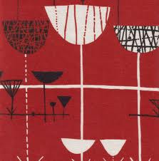
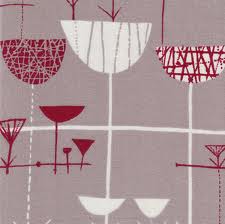
My fabric is from the Linear design, it was featured in two colourways in this exhibition but the lime green and purple colour that I have seems to be a bit less common….I do adore the colours of mine, I was planning to make blinds for my window from it…but, eeek, Vicky suggests that would be a similar sin to cutting up an Ossie Clark dress so I am all in a bother…do I keep it safe and not use it or do I make it into something useable that I can look at everyday….ugh…

I knew very little about Mahler before finding out this fabric was one of hers, but now I am discovering her work I bloomin adore it, it’s cool that is is slightly less overused than Lucienne Day’s work, I am particularly in love with this Untitled (Vases) work;

…and this Bird Chair print from 1952….swooon….

And obviously I do love Day’s stuff too, I think this work, Fall, is the most lovely….the colours do make my eyes very happy.

Something else that makes my heart happy is cats….and whilst I was last in London I saw this cat art in Brick Lane…

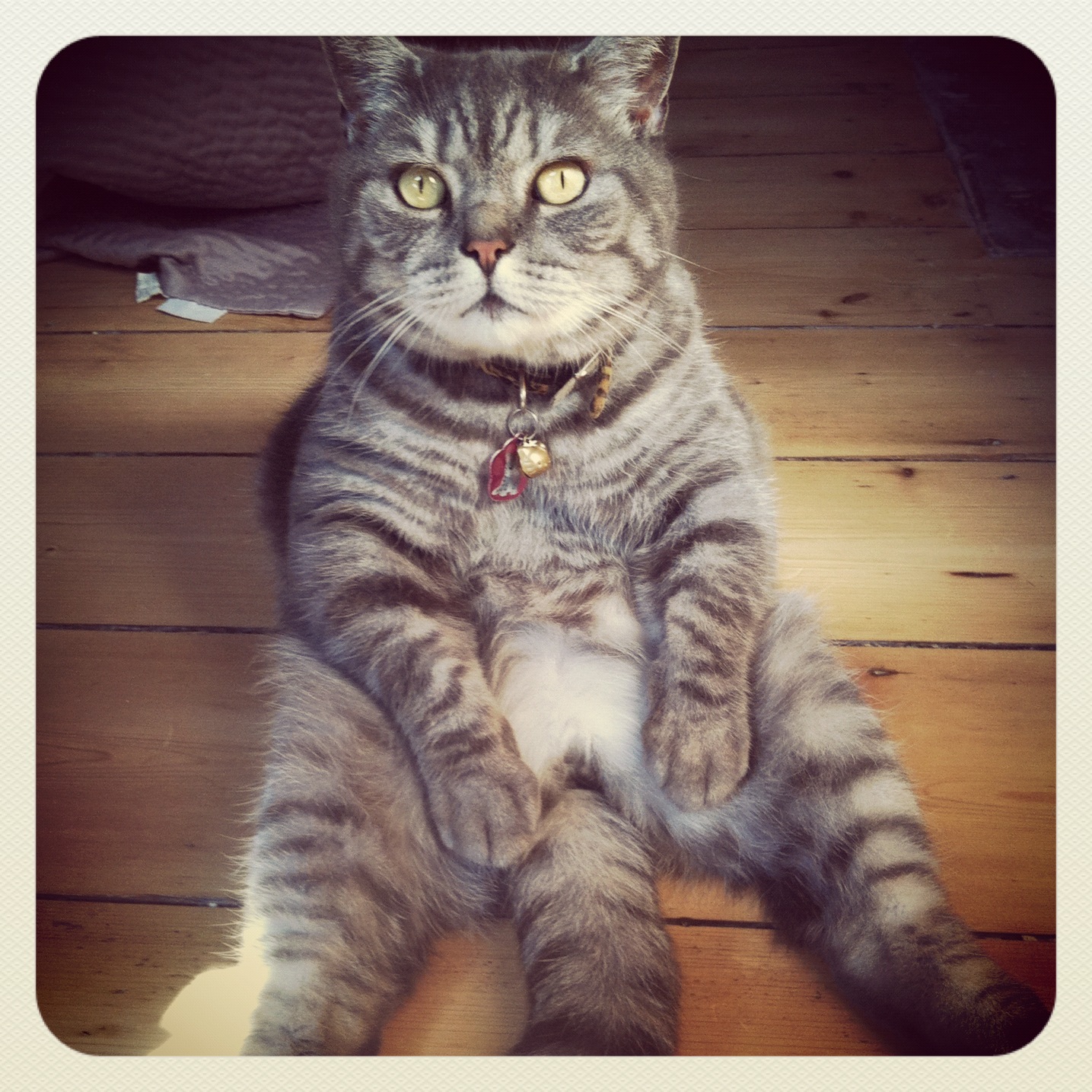
…and then I got home to my cats…of which this is one.

…maybe I should make my cats some Mahler moggy beds….they do deserve them and I do love them so…….

Take a nice long look at www.somethingfine.co.uk, and visit www.ftmlondon.org for all the goings-on at the Fashion and Textile Museum.

Print-cess Mary Katrantzou

Mary Katrantzou walked into the room wearing head to toe black. For a woman whose fashion designs are known for pioneering bright, fussy, intricate and vivid print, I was kinda surprised that she was dressed so plainly. I liked the contrast though between the images her name conjures up and the simple dark silhouette she commands when in front of you. I went to ‘An Evening with Mary Katrantzou’ at the Fashion and Textile Museum, as with the talk by Pat Albeck, this was a small informal group and Mary chatted about her career in fashion design. She spoke of how happy she was that finally print in fashion was shifting and evolving and women were becoming more open to wearing print as well as all black. When questioned why she herself was dressed in all black, Mary replied ‘All year round I wear the same, a black A-line skirt and a black long sleeved top, I’m known for it, I am not known for wearing print. When you are constantly creating and working with colour and print, you need a plain uniform to counterbalance it. My flat is as plain as it gets, all white walls and wooden floors, nothing else.’ I like this, I think it would be pretty crazy if her whole life, every aspect, was about prints and colour, the dissimilarity between her work and home life must keep her sane.

Greek born, Mary studied in the USA at Rhode Island School of Design and then went on to St Martins where she completed her BA and MA. Her original interest was in architecture, then fabric, and then she moved into fashion. ‘Once you start working with the body, a 3D figure- everything changes. You never know how a pattern will look and change on the figure, the way it swings, the way pleats hang..’ she seemed to have been really fascinated by how her print designs could take on a whole new form through shape and movement. Once you work with the female figure ‘you become a fashion designer’.

Mary’s fashion designs are all about print, when she first started, it was stilll early days of digital print, she taught herself Photoshop and still, today, it is the only programme she uses. In her Graduation show, she had 9 dresses, all identical in silhouette but with different intricate and bold prints. Mary confesses that she is not able to pattern cut herself, she works completely on the model. Her interest in architecture comes into play as she adds the fabric to the model, shapes it so that it flatters and hangs as she wants it to, her dresses have a real sculpted, and architectural element.

Mary loves women, she knows women and she designs for women. She chatted about one of her earlier collections where she took items that women coveted but couldn’t physically wear, like perfume bottles or vases and put them in print form on a dress, enabling the woman to wear what she loves in a new form. I love this concept. It has a real tongue in cheek element as well as being utterly beautiful in itself. Some of her dresses are pretty surreal and abstact, quite sci-fi too. But, a woman after my own heart she says, ‘It should be as viable to make a dress a woman can treasure and collect and wear once, as it should be to make a dress a woman can wear 500 times’. Oh yes, dresses aren’t always things to be worn over and over, they can be purely an object to love and adore for it’s form and beauty.

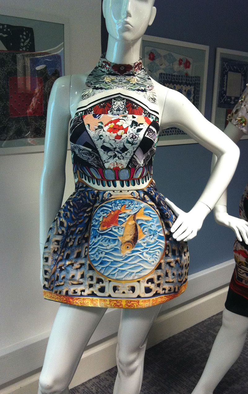
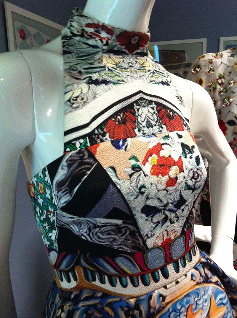
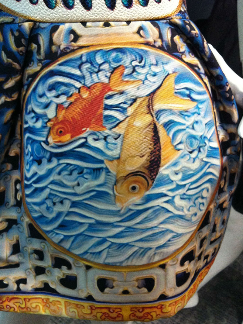
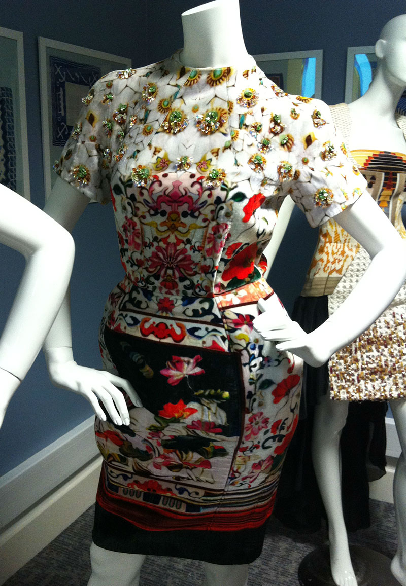
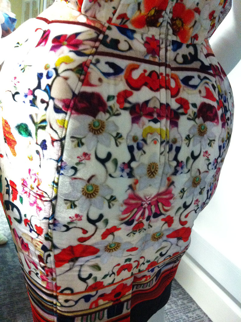
Three of Mary’s dresses were on display for us to look at; the first is a really cute and kinda futuristic sculpted shape, different sections and fabrics with contrasting prints, she told how her inspiration was to take elements of ornamentation from different countries and cultures; tapestries, florals, vases, and put then all in one dress……very gorgeous and pretty wearable too.

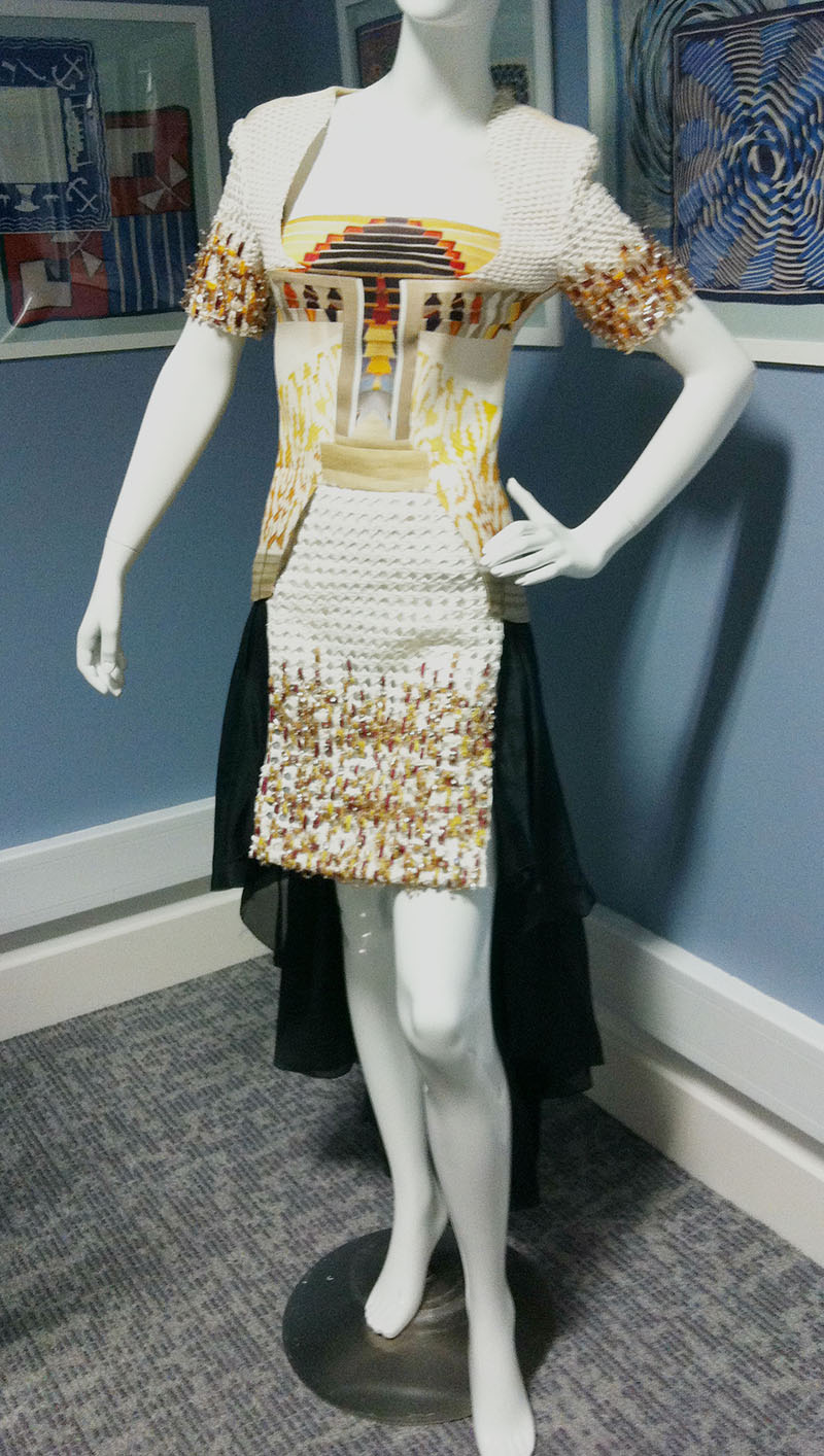
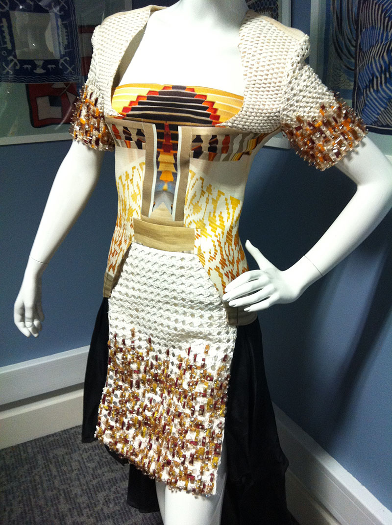
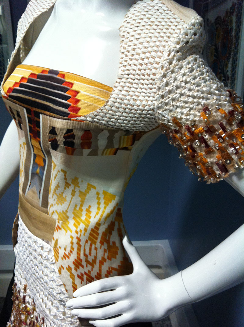
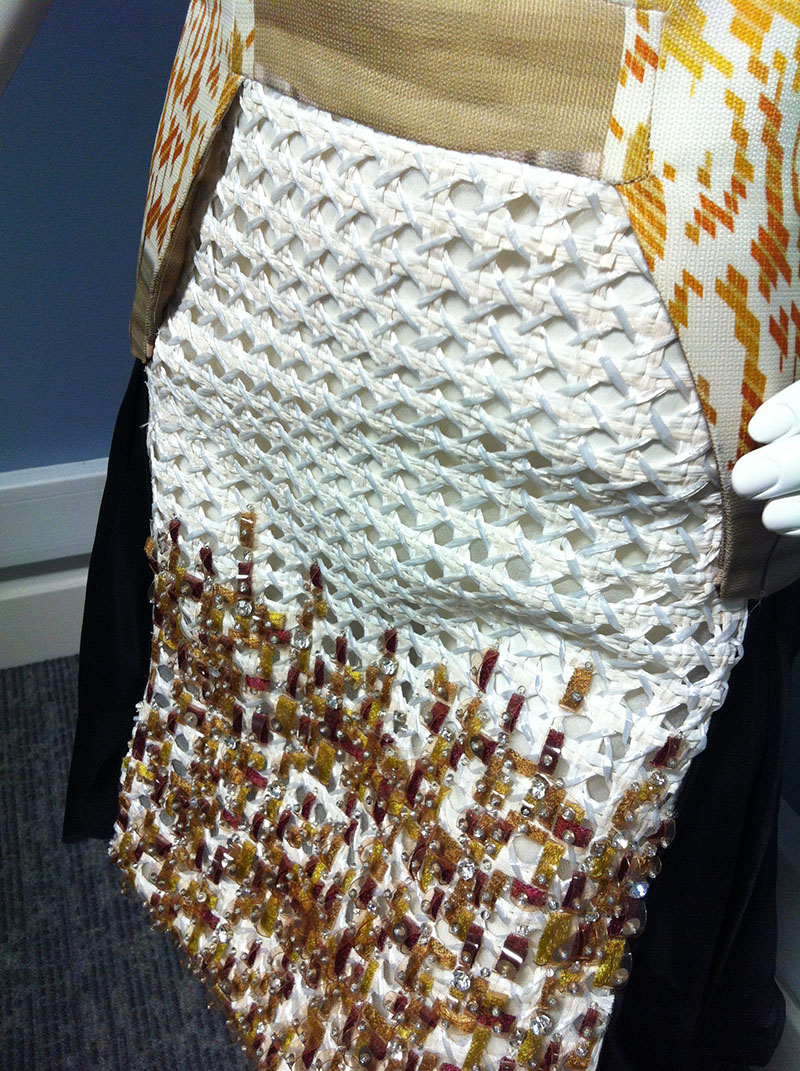
This next dress has so many elements, the mixed layers of raffia, silk, canvas and beading mixed with the different prints make it a really stunning piece…

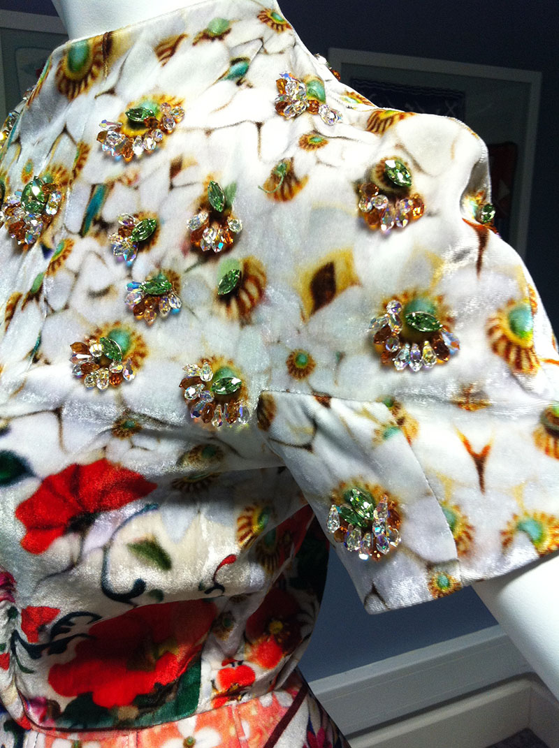
This last dress is my favourite, plush velvet with different prints, the colours are really vivid and Swarovski jewels have been hand-applied to excentuate the colurs…beautiful!

Twas a lovely few hours looking at lovely dresses with some lovely people, Mary said how thrilled she is that her dresses are worn by women from ages 25 to 65, ‘and they all wear them equally well’. 

For more information visit www.marykatrantzou.com

In Conversation With Pat Albeck

‘There was a crusade to get rid of bouquets and chintzy prints on beige or fawn backgrounds.’ Pat Albeck

What a lucky girl I was to be able to attend the Fashion and Textile Museum when they had an evening with Pat Albeck. A small group of us got to listen to her talk intimately about her life in textile design, a real treat indeed. I had an awareness of Pat’s work, most notably her designs for Horrockses dresses in the 1950’s, I adore Horrockses and their iconic printed dresses so I was fascinated from the start. Her informal chattiness was lovely, now in her 80’s, Pat was dressed in her favourite bright orange and was really keen to dig into her memories for us all….

Pat Albeck, British textile designer, born in 1930, grew up with a love of design and decor. She was unsure what direction to take in life and went to study at art school in Hull where her family were based, she said she felt that all the other students were much better illustrators than her, she preferred to work with patterns and colour. She then got into the Royal College of Art, London. Her Father, luckily, had known the Principle there, she clearly felt she was not worthy of this place at the college as she remembered a critic once saying ‘even the Royal College makes mistakes’. One of her predecossors being the now iconic designer Lucienne Day, Pat’s time at RCA was around that of the Festival of Britain and designers wanted to revolutionize textile design. She said that she now believes she was at the college at the best possible time. Pat and her contemporaries wanted a new look to design, to move onwards from the floral cutesy and safe prints of earlier pre-war years. ‘I was very influenced by the new ideas in furnishing textiles from Scandinavia and the fashion fabrics from France and Italy’. This modern approach was an extremely exciting and pivotal movement in the design ideas of the 1950’s.

Pat loves flowers, she felt other designers could deconstruct flowers and strip them of their petals, making for abstract designs, she prefered to draw them more realistically whilst still in a new way. I got the impression from her talking that she felt inferior to some of the other designers at the time, ‘I think poeople thought, she’s ok but very commercial‘ she said. I think her work was as relevant and as new, but came from a slightly different and possibly more feminine angle than the likes of Lucienne Day and Marian Mahler.

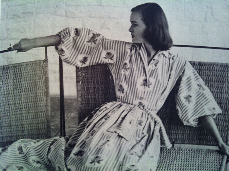
In 1952, Horrockses designer James Cleveland Belle was visiting the RCA looking for talented students to work with him, he discovered Pat. Pat had been focusing her studies on furnishing fabrics, since fashion fabrics had been considered somewhat ephemeral at the time. Pat said she never thought of clothes as fashion, ‘I just thought of it as a new dress’. Pat recalled owning a Horrockses dress when she was 16, designed by Alastair Morton. I think every girl then probably dreamt of owning a Horrockses dress. Horrockses had previously been known mainly as a brand that sold quality cotton household goods; sheets, towels and bed linen, with the tag line ‘The Greatest Name in Cotton’. The company eventually concieved ‘Horrockses Fashions’ and it was for the fashion line that Pat sold her first design. She was one of the lucky few students to sell designs whilst still at college. This ‘Stripes and Roses’ was the first design she sold and it was also in her final RCA show. Horrockses were well known for their use of stripes on dresses, ‘It was exactly what he wanted’ Pat said, the design was used to make a housecoat designed by Betty Newmarch, this picture of it, Pat said, is still her favourite image of her time at Horrockses.
And so after graduating, Pat was offered a salaried position at Horrockses. From this point on in her career she said she pretty much always ‘designed with specific pieces in mind’ there was always a brief that she would work to. She clearly adored her time with the brand, during it she worked from home as they had no space at the head offices, but she was always present at design meetings and gatherings. She beamed as she referred to her team there as the ‘formidable four’; that four being designers John Tullis, James ‘Jimmy’ Cleveland-Belle (who she said is a great friend and genius), Marta Pirn and Betty Newmarch. These designers came up with the dresses while Pat designed the printed fabric…a formidable gang for sure!

Whilst being asked to design for specific garments, Pat told us about the time when Tullis asked her to draw a lobster for a beach skirt, she bought the lobster, put it through expenses and labouriously drew it but felt it looked odd on its own, so added her signature flowers and some butterflies. When the accountant saw her receipt for the lobster he joked ‘I hope you ate it after’ to which she replied ‘it took me three days to draw!’

In the late 1950’s British fashion manufacturing took a blow as far East countries began to mass produce man made fibres. To keep up with the increased competition, Horrockses parent company had to cut costs and needed to lessen the quality of their cotton. During this time James Cleveland Belle left, shortly followed by Pat in 1958. She said she still considers her work for Horrockses to be one of the most important times of her career.

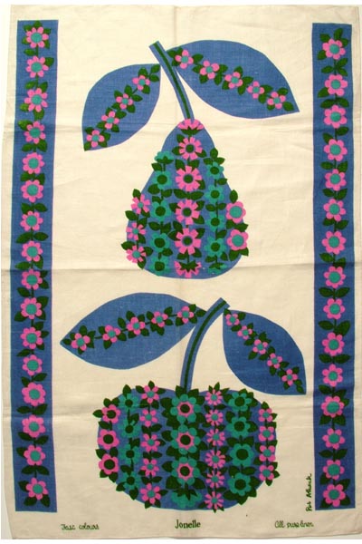
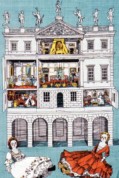
Pat said that her favourite things to draw have always been ‘all things natural; fish, flowers, fruit and vegetables’ and she would often put a rose in there somewhere to ‘soften the motif’. I love the simplicity of her drawings and the casual element of humour too. After leaving Horrockses Pat went on to work for lots of different companies including Sanderson, John Lewis, fashion label Dolly Rockers and also The National Trust. It is with the National Trust that Pat famously designed many tea towels, the job perfectly combined her love of British historical houses and design. It evolved so that Pat was designing kitchen ceramics, table cloths and linens too, each for specific National Trust locations. Pat also did a lot of work in the 1970’s with a lady called Maxine Magan who started a cottage industry called Cuckoobird. This team were responsible for making lots of kitchen ware and home ware including the well loved cottage shaped tea cosy!
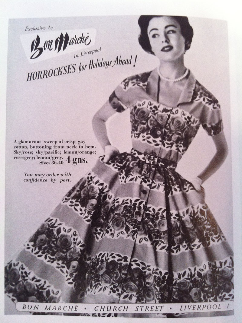
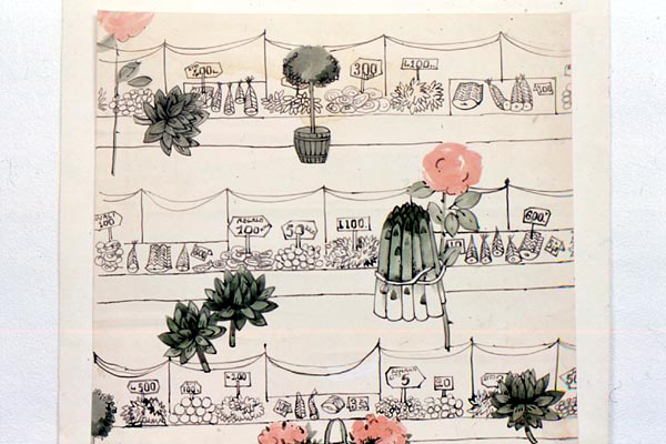
I especially like how Pat’s work in each era is totally characteristic of that decade and the style of the time, in vintage fashion, most pieces are clearly definitive of their time, and with Pat’s work you can see how the style and process of design has changed. Pat now lives in Norfolk, ooh same as me, she adores cats, same as me too, and still draws every day. She has a local exhibition later this year at Verandah, an independent artists shop here in Norwich which I shall take a peep at for sure. A funny fact about Pat is that her only son is married to another well known British designer, Emma Bridgewater, an eye for style is a quality that her son must love in his ladies. A gorgeous evening in the company of an utterly fascinating woman, she had nothing but good to say about her time working for Horrockses and all the other brands.

‘All the people I have worked with became my friends.’ Pat Albeck

For more information on Pat visit www.patalbeck.co.uk

For details on Pat’s Norwich exhibition visit www.verandahnorwich.co.uk/

Dresses in the Basement

Ooh. My.

Such utter loveliness tucked away in the basement of London’s Selfridges!

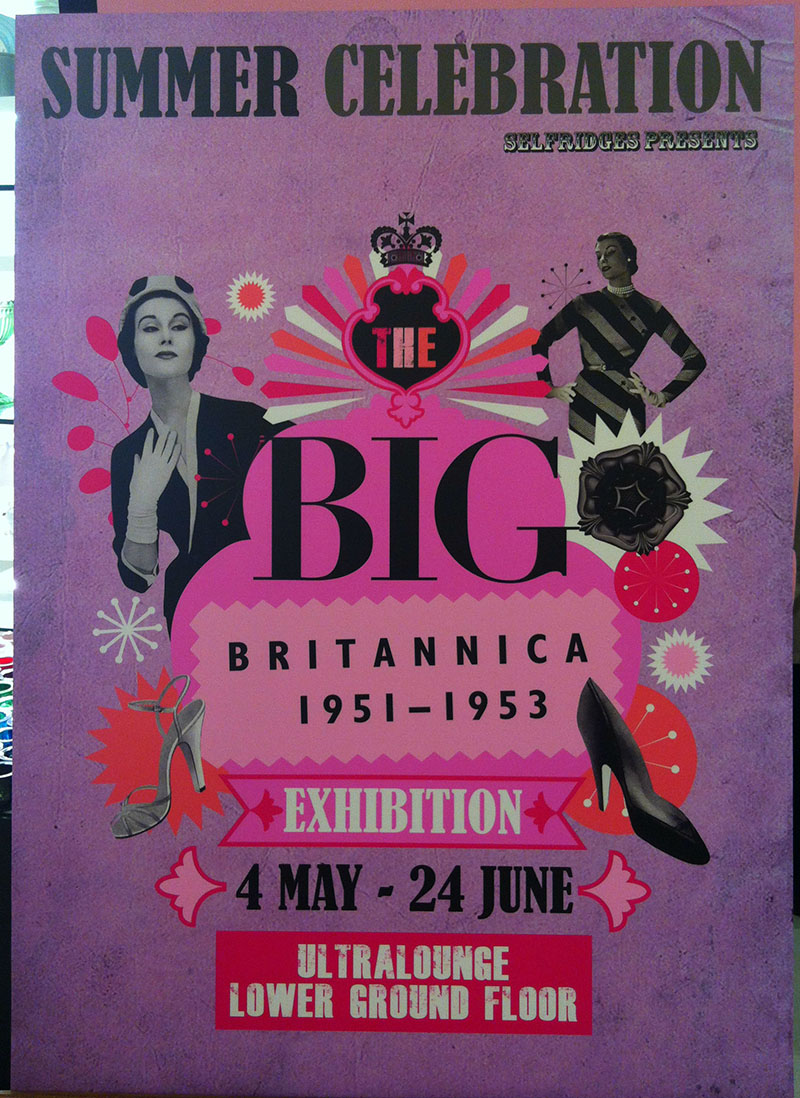
Throughout the Selfridges summer celebration of all things lovely and British, they are showing a most adorable vintage fashion exhibition in their Ultralounge, which is tucked away in their basement, it’s so beautifully quiet and tucked away I felt like I had stumbled across a secret magical land of dressses….dreamy indeed.

This Britannica exhibition is curated by Judith Clark, a well known figure in the world of Fashion and Museology, she currently lectures on the Fashion Curation MA course at London College of Fashion…. her knowledge is massive.

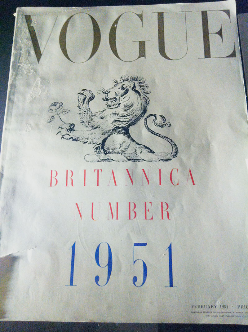
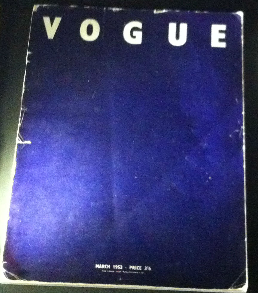
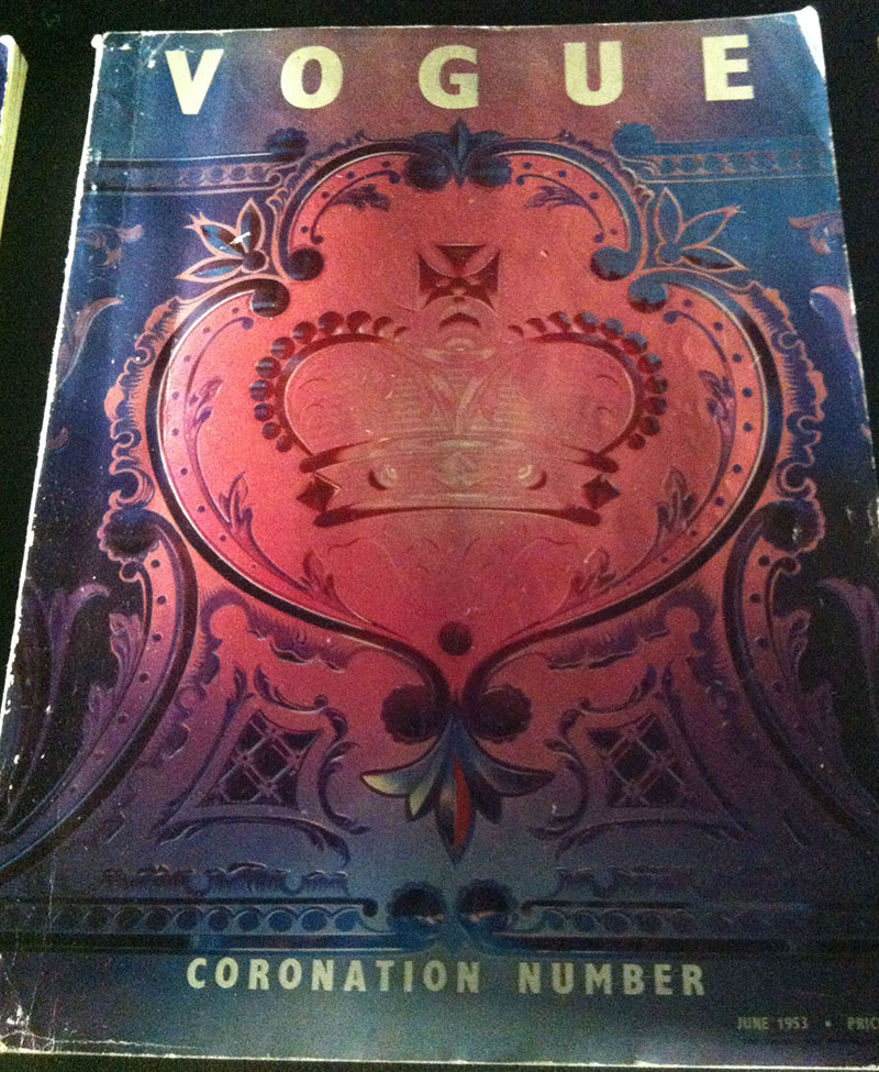
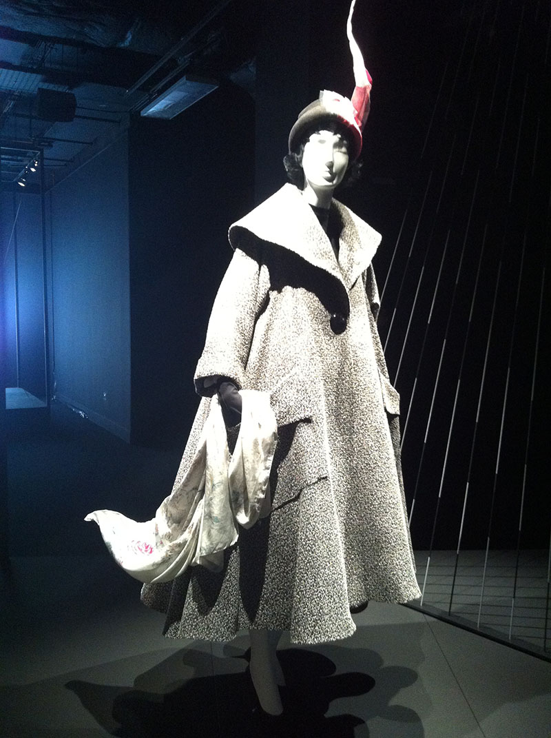
This exhibition is small but most perfectly formed, it’s really dark, and lit to perfection, focusing on silhouettes and the lines of the clothing. It consists of seven installations inspired by 3 issues of British Vogue. In 1951, Vogue brought out a special ‘Britannica’ issue which was so popular they issued it again for the following two years in February, covering both The Festival of Britain and the Coronation of Queen Elizabeth II. The issues looked specifically at Britishness, post war style, culture and Britain’s ability to embrace old traditional style with a fresh nod to the new. In February 1951 Vogue put on a fashion show in Selfridges which then went on to show in other cities in Britain, oh my, imagine how lovely it would have been to see that! These simple wearable patterns sketched in Vogue could be imagined in any fabric and so were considered applicable to many shoppers. The Coronation colour was named Champagne Pink, it would be used again and again to celebrate our ‘English Rose’ Princess Elizabeth.

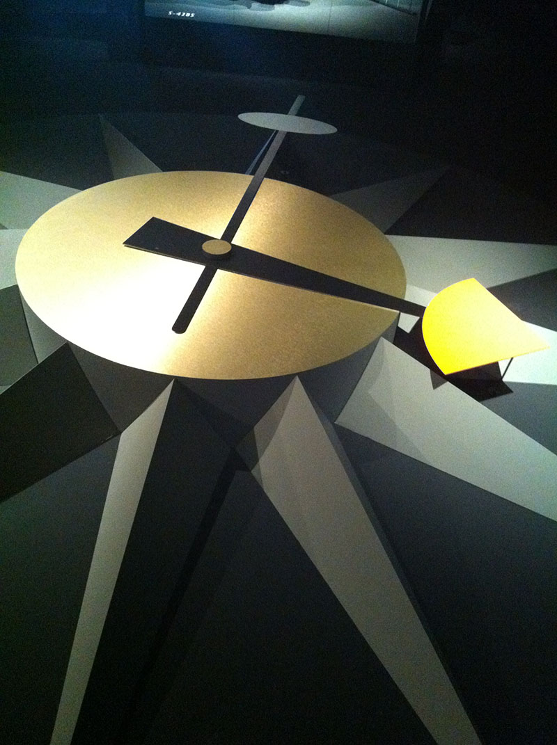
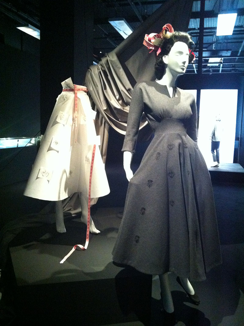
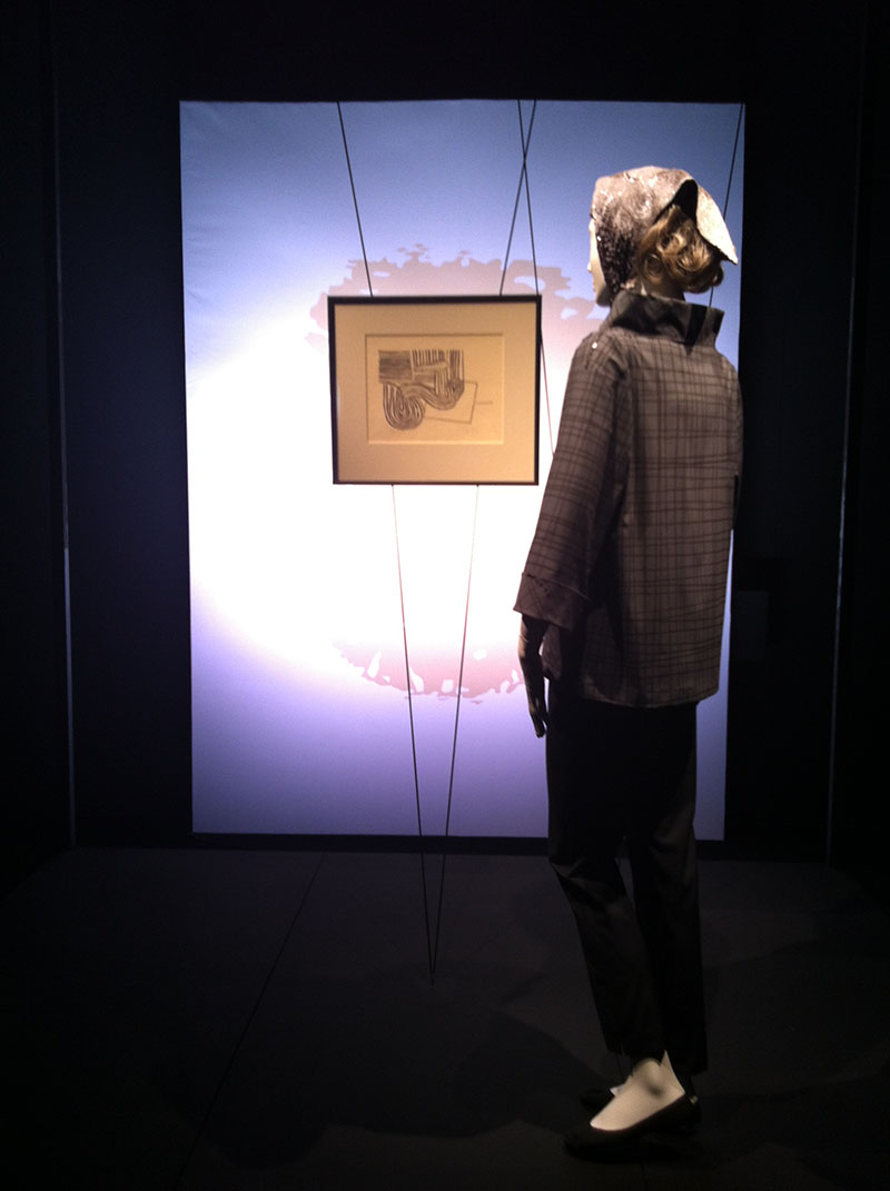
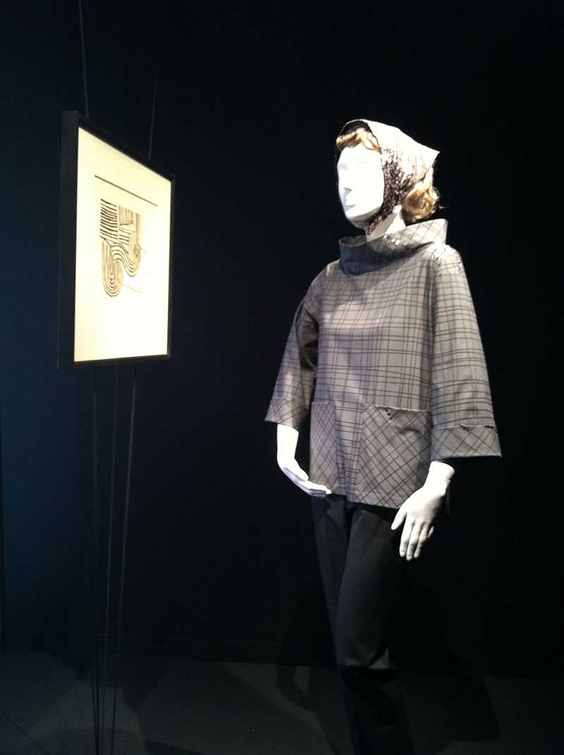
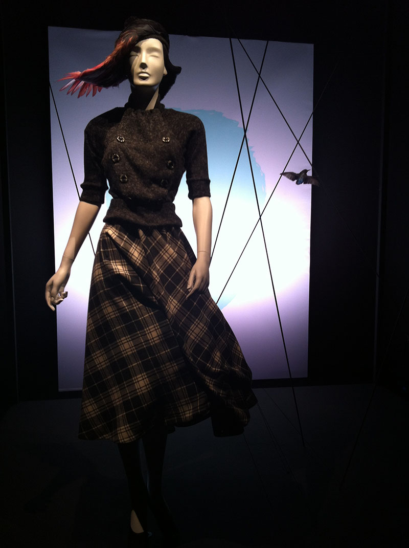
The exhibition is seven mannequins, each in a scene, seven ‘living pictures’, each figure wearing one of the Vogue patterns, made up in a grey colour as they were first sketched. This exhibition is so enchanting, it’s like you stumble across a hive of gorgeousness and calm where time stands still, hidden under the rush of central London. This is so expertly styled, the dark shades of grey with splashes of pink are perfect, and the clash of quirky hats are by Stephen Jones, I’m not generally a hat gal, but crikey, these designs are amazing and a perfect dash of modernity. In the centre of the room is a large 1950’s stylised clock face, as a reminder of the formality of the early 50’s, dresses are wholly appropriate to certain times and places.

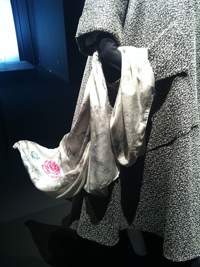
Each outfit shows a different time in the girls day…the first is her at 10am in a grey swing coat holding a silk scarf…

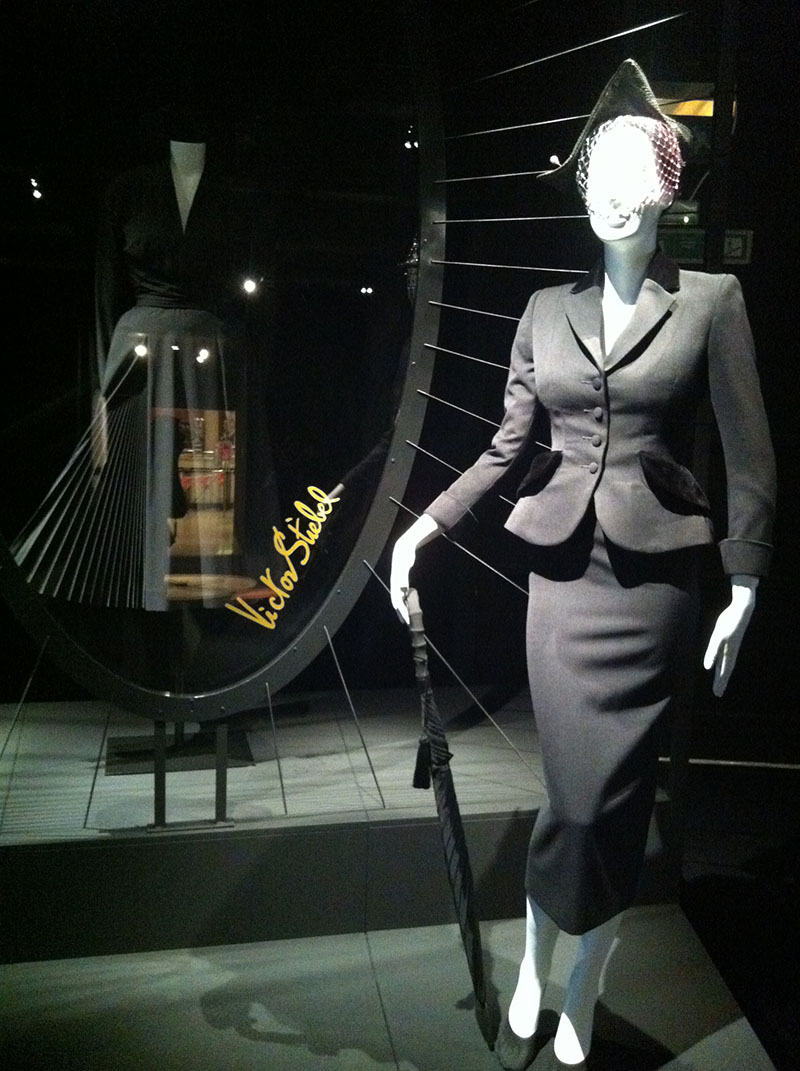
…the second is her gazing at a mannequin in a shop window in an amazing slim skirted suit which has velvet detailing…..

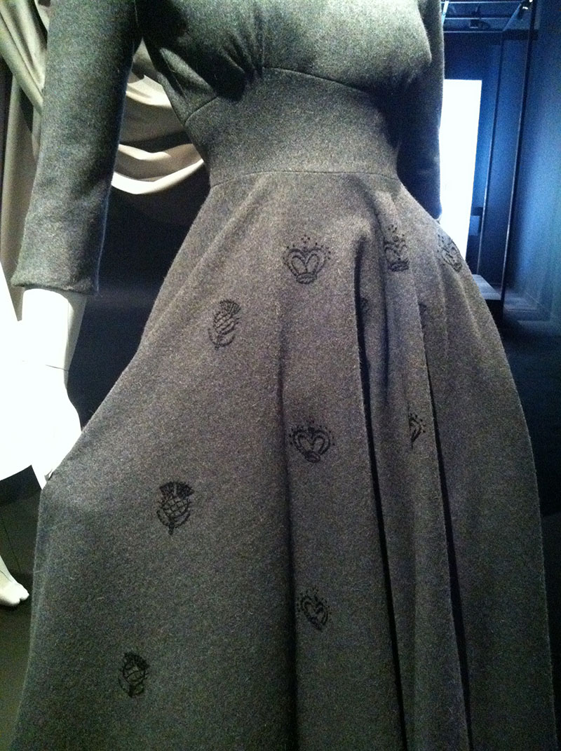
…the third scene is of a presentation of Vogue patterns in a department store…this dress is a heavy wool fabric with embroidered thistles and crowns….

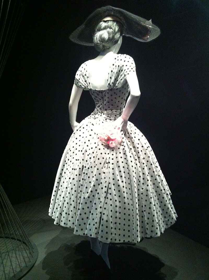
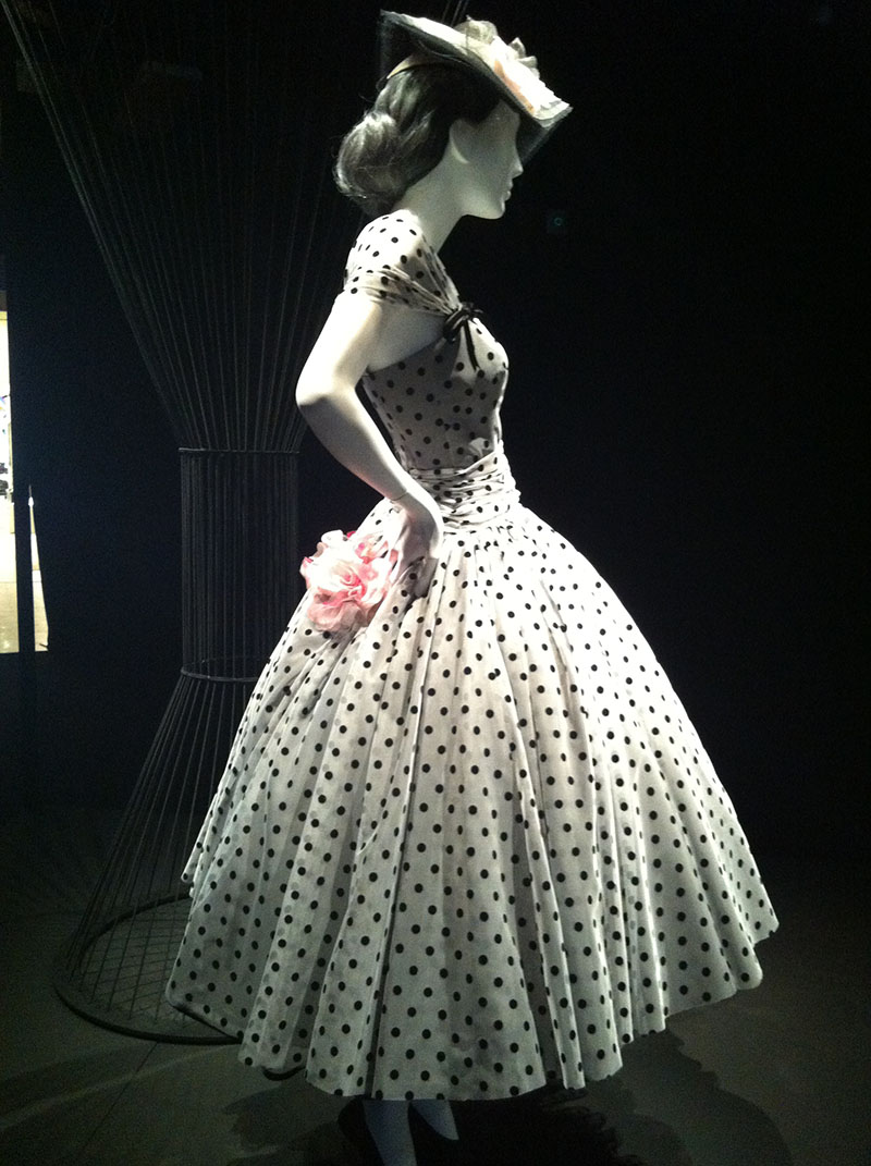
….the fourth shows her at 5pm at a cocktail party in a full skirted dress with black polkadots….this is such an amazing dress, they all are, but this one looks especially beautiful in the spotlight…

…then we see her at 8pm going to The Ball in a regal, full length strapless, sparkle encrusted gown…

…the sixth scene shows her at an urban gallery in a great coat and trousers with a head scarf…

…the last is a country scene where she wears a wool check swing skirt and knitted top…

This exhibition is a small masterpiece, the styling, lighting, colouring and the clothes themselves are just plain beautiful. 1950’s fashions are timeless in their appeal, they just ooooze femininity and are always a shape women are drawn to, every single look in this exhibition translates to todays fashion and could be worn onto the streets above and look nothing but current, Vogue always gets designs so right.

This exhibition is on until 24th June 2012, it’s gorgeous, free and will fill your belly with pure gleeeee!